Python Language
Data Science in Python:
Data science in Python involves using various libraries and tools within the Python programming language to analyze, manipulate, visualize, and interpret data.
Python has become one of the most popular programming languages for data science due to its simplicity, versatility, and a vast array of libraries specifically designed for data manipulation, analysis, and visualization. Let's break down the concept of data science in Python with a simple coding example.
We'll use the popular libraries 'NumPy', 'Pandas', and 'Matplotlib' to perform basic data analysis and visualization tasks.
# Import necessary libraries
import numpy as np
import pandas as pd
import matplotlib.pyplot as plt
# Set the style to dark background with white text
plt.style.use(
{
"figure.facecolor": "#222", # Custom background color
"axes.facecolor": "#222", # Custom background color for axes
"axes.labelcolor": "white", # Text color for labels
"xtick.color": "white", # Text color for x-axis ticks
"ytick.color": "white", # Text color for y-axis ticks
}
)
# Generate some random data
np.random.seed(0)
num_samples = 100
x = np.random.rand(num_samples) * 10
y = 2.5 * x + np.random.randn(num_samples) * 2.5
# Create a Pandas DataFrame
data = pd.DataFrame({"X": x, "Y": y})
# Display the first few rows of the DataFrame
print("First few rows of the data:")
print(data.head())
# Summary statistics
print("\nSummary statistics:")
print(data.describe())
# Scatter plot of the data
plt.figure(figsize=(8, 6))
plt.scatter(data["X"], data["Y"], color="blue", label="Data Points")
plt.xlabel("X", color="white") # Set text color to white
plt.ylabel("Y", color="white") # Set text color to white
plt.title("Scatter Plot of X vs Y", color="white")
plt.legend()
plt.grid(True)
plt.show()
# Correlation between X and Y
correlation = data["X"].corr(data["Y"])
print("\nCorrelation between X and Y:", correlation)
# Simple linear regression
from sklearn.linear_model import LinearRegression
# Prepare data for modeling
X = data[["X"]]
Y = data["Y"]
# Create and fit the model
model = LinearRegression()
model.fit(X, Y)
# Print the coefficients
print("\nLinear Regression Coefficients:")
print("Intercept:", model.intercept_)
print("Coefficient:", model.coef_[0])
# Predictions
predictions = model.predict(X)
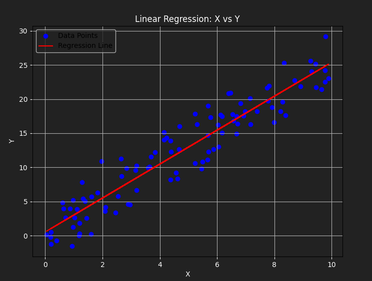
# Plot the regression line
plt.figure(figsize=(8, 6))
plt.scatter(data["X"], data["Y"], color="blue", label="Data Points")
plt.plot(data["X"], predictions, color="red", label="Regression Line")
plt.xlabel("X", color="white") # Set text color to white
plt.ylabel("Y", color="white") # Set text color to white
plt.title("Linear Regression: X vs Y", color="white")
plt.legend()
plt.grid(True)
plt.show()
First few rows of the data:
          X          Y
0  5.488135  10.807463
1  7.151894  20.131800
2  6.027634  16.233241
3  5.448832   9.781470
4  4.236548  14.312000

Summary statistics:
                X           Y
count  100.000000  100.000000
mean     4.727938   12.300682
std      2.897540    7.620958
min      0.046955   -1.513415
25%      2.058032    5.382785
50%      4.674810   12.488958
75%      6.844833   17.936766
max      9.883738   29.173335

Correlation between X and Y: 0.9445225692562866

Linear Regression Coefficients:
Intercept: 0.5553776936180661
Coefficient: 2.4842337553505103
• Explanation:
1. Import 'NumPy' for numerical operations, 'Pandas' for data manipulation, and 'Matplotlib' for data visualization.
2. Generate some random data points representing a linear relationship between X and Y variables.
3. Create a Pandas DataFrame to organize our data.
4. Display the first few rows of the DataFrame and its summary statistics.
5. Create a scatter plot to visualize the relationship between X and Y.
6. Calculate the correlation coefficient between X and Y.
7. Perform simple linear regression using the LinearRegression model from scikit-learn.
8. Print the coefficients of the regression model and make predictions.
9. Finally, Plot the regression line along with the original data points to visualize the linear relationship.
Note: Data science in Python encompasses a wide range of tasks, including data manipulation, analysis, visualization, and modeling.
What's Next?
We've now entered the finance section on this platform, where you can enhance your financial literacy.